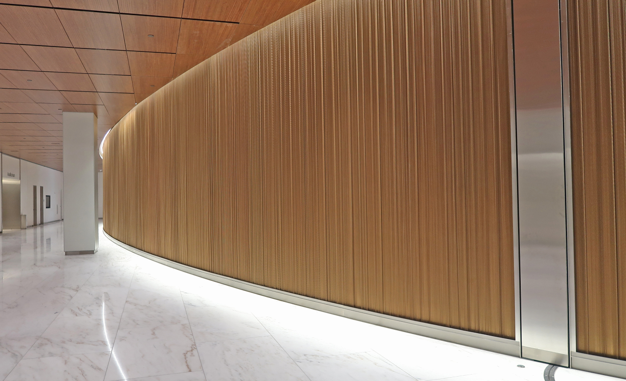
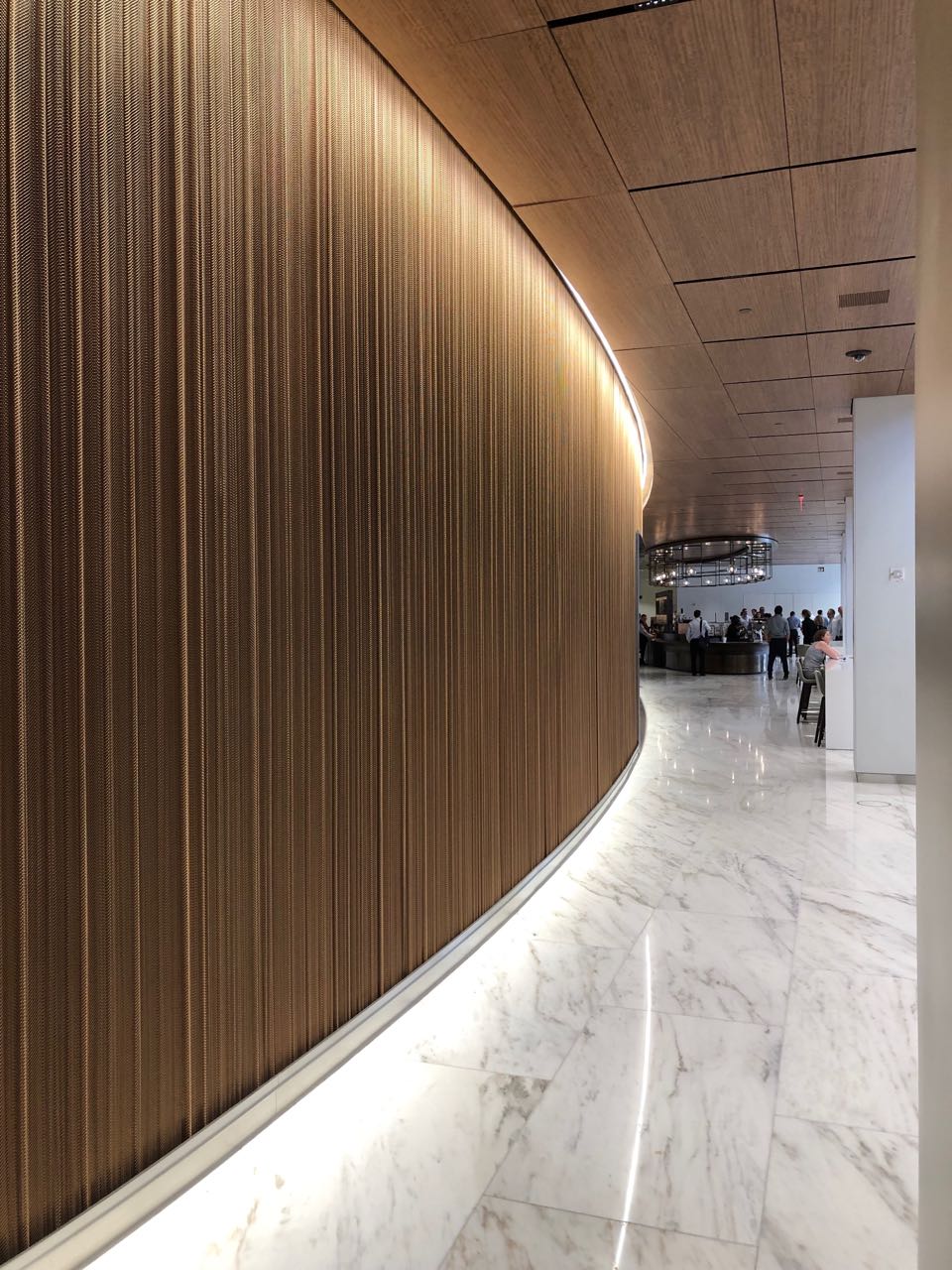
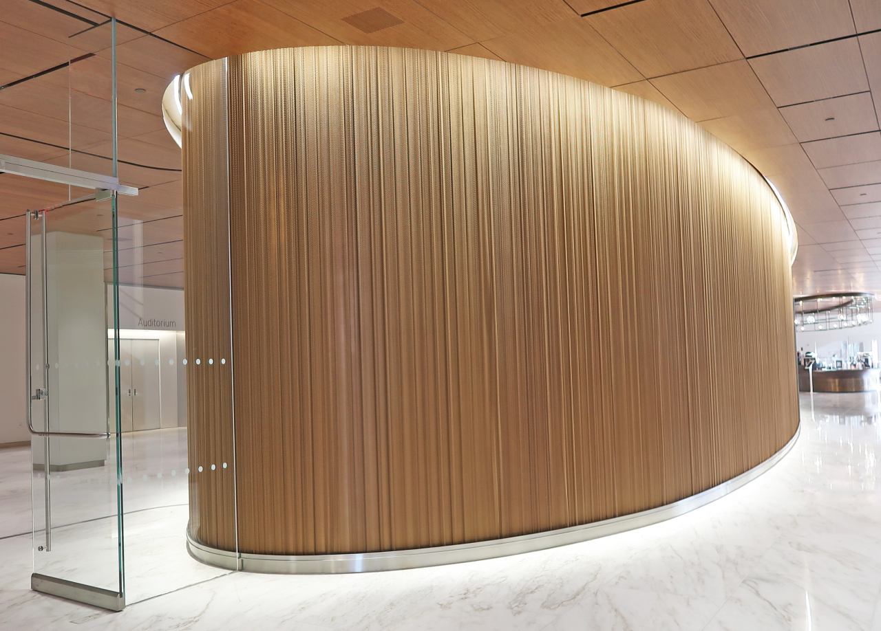
SOM & Gensler Select Seamless Satin Bronze Fabricoil Vertical Wall Coverings on Custom Curved Steel Secura Track System for Lobby Design at Major Financial Institution in Heart of Manhattan
Over 4,100 sq. ft. of 1/4"-18 ga. Steel Satin Bronze Fabricoil® Wall Cladding System Featured in Striking Interior Design at Leading Financial Institution Lobby Design
Location: New York City, New York
Architect: Skidmore Owings & Merrill
Interiors: Gensler
The Project:
In 2014, a leading financial institution made the decision to renovate its large headquarters complex in the heart of Manhattan Island in New York City. The architecture firm of Skidmore, Owings & Merrill was tasked with combining two existing, adjacent properties into a single 2.6-million-square-foot renovated facility. Building work included an updated facade and a revamped public plaza along Greenwich Street. For the interiors, the firm of Gensler was retained. The combined structure includes four 98,000-square-foot trading floors connected by an internal staircase plus a new lobby and open, collaborative workspaces. There is a similar grand staircase linking two “client center” floors with an executive office floor.
The Challenge:
The first thing addressed was how to successfully combine a 39-story office tower with a nine-story printing plant into one cohesive workspace that met the company’s needs. The structural engineer for the project proposed replacing a solid wall with a row of columns which was ultimately done on the first three floors. The architects wanted to extend that idea all the way up to the roof to create a 14-floor atrium, but the bank didn’t agree to that plan based on expense and disruptions to workers. The bank also wanted to assign 20 to 30 percent more people per floor than they wanted to provide workspaces for, since roughly a third of the employees would not be working in the office on any given day.
The Solution:
The renovated design included a new entrance area and a three story “town square” where workers can meet and socialize at couches and tables. This was achieved by removing some portions of floors and substituting the wall between the two buildings with columns at the town square floors. The two upper mezzanine floors include elevator lobbies and open meeting areas, and artwork. Amenities in this area include mounted television monitors that display news stations, an in-house Starbucks coffee counter, and an art gallery. Off of this area, there is now an auditorium and a new cafeteria with multiple food stations.
Above this common area, 19 additional floors were created. These are workspaces where workers can sit at any desk and store their extra belongings in lockers. The global headquarters site president at the financial institution has been quoted as saying “We went to a 20 percent oversubscribed model, where we have 230 seats on the floor and we put 325 people assigned to the floor.” This model seems to be working well, particularly since each of the floors has its own small kitchen and seating area where workers can socialize and eat lunch.
The Role of Wire Fabric:
SOM wanted a material that would provide a continuous look around each area. Wire fabric was selected because it offered the ability to splice the material together onsite creating one seamless panel and help achieve the design appearance SOM was seeking in these areas. In particular, they wanted to cover an elliptical-shaped area in the Town Square in a way that was flexible and controllable. To alleviate the potential of someone pulling the material up, but still maintain a pleated look, both a top and bottom mounting track were required. By utilizing a custom, elliptically curved top and bottom track with bolts, the manufacturer was able to deliver both the stability that was required as well as the pleated look.
The Results:
The renovated building is more functional, more practical, and offers a much better design presence than the prior arrangement.


